

I couldn’t launch a new site without building an identity and brand. How successful I’ve been is a matter of opinion.
This is just a fun side project for me so it’s not that critical but I really enjoy the process and I’m pleased with the result.
The logo feels a bit generic and I’m worried it already exists! I did a fair amount of research to check if other companies have used a similar design for the “CT” characters.
I haven’t created a monogram logo before and I found the combination of “CT” quite challenging. I settled on incorporating an arrow as an abstract “T”. Connecting the “C” creates a pleasing shape and also a hidden “map marker” in the counter.
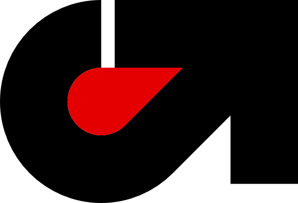
The arrow signifies to me the idea that when I’m out on the trails I can go anywhere. I might set out with a route in mind and sometimes I just make it up.
Once I’d finalised the shape, I had some fun thinking about how I can make variations and incorporate it into other designs.
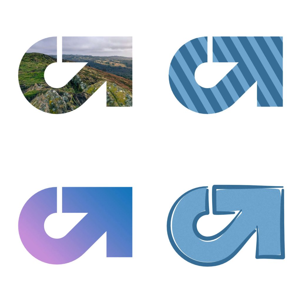
I haven’t settled on a palette for the logo or site yet. Expect to see some experimentation over the next few months.
Leave a Reply